

微信是一个生活方式,朋友圈是用户分享和关注朋友们生活点滴的空间,微信公众平台是一个企业、机构与个人用户之间交流和服务的平台。一直以来,微信致力于为用户提供绿色、健康的网络生态环境。通过《微信公众平台服务协议》、《微信公众平台运营规范》和《微信开放平台开发者服务协议》等相关协议及专项规则,微信公众平台和微信开放平台的内容得到了良好的管理。为了进一步优化微信用户的使用体验,更好地保障微信用户合法权益,现将非由微信公众平台产生(即域名地址不归属于微信公众平台)且在微信内传播的外部链接内容相关管理规范进行公示。
对于违反本规范的内容,一经发现将立即进行处理,包括但不限于停止链接内容在朋友圈继续传播、停止对相关域名或IP地址进行访问、屏蔽相关链接等。由微信公众平台或开放平台帐号施行或者发起的,一经查实,前述帐号、主体也将按照微信相关规则进行处罚,包括但不限于限制或禁止使用部分或全部功能、帐号封禁直至注销等,并公告处理结果;微信也有权依照本规范及相关协议、专项规则的规定,拒绝再向前述主体提供服务。
具体规则及相关处罚如下:
-
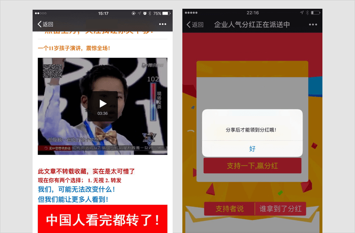
诱导分享类内容
-
1.1 要求用户分享,分享后方可进行下一步操作,分享后方可知道答案等;
-
1.2 含有明示或暗示用户分享的文案、图片、按钮、弹层、弹窗等的,如:分享给好友、邀请好友一起完成任务等;
-
1.3 通过利益诱惑,诱导用户分享、传播外链内容或者微信公众帐号文章的,包括但不限于:现金奖励、实物奖品、虚拟奖品(红包、优惠券、代金券、积分、话费、流量、信息等)、集赞、拼团、分享可增加抽奖机会、中奖概率,以积分或金钱利益诱导用户分享、点击、点赞微信公众帐号文章等;
-
1.4 用夸张言语来胁迫、引诱用户分享的。包括但不限于:“不转不是中国人”、“请好心人转发一下”、“转发后一生平安”、“转疯了”、“必转”、“转到你的朋友圈朋友都会感激你”等;
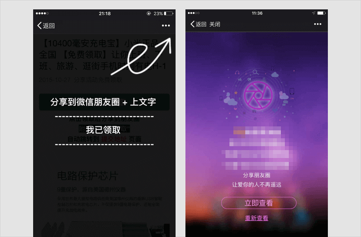
若内容中包含以上情况,一经发现,立即停止链接内容在朋友圈继续传播、停止对相关域名或IP地址进行的访问,短期封禁相关开放平台帐号或应用的分享接口;对于情节恶劣的情况,永久封禁帐号、域名、IP地址或分享接口。
-
-
诱导关注类内容
-
强制或诱导用户关注公众帐号的,包括但不限于关注后查看答案、领取红包、关注后方可参与活动等;
若内容中包含以上情况,一经发现,立即停止链接内容在朋友圈继续传播、停止对相关域名或IP地址进行的访问;对于情节恶劣的情况,永久封禁帐号、域名、IP地址。
-
-
H5游戏、测试类内容
-
以游戏、测试等方式,吸引用户参与互动的,具体形式包括但不限于比手速、好友问答、性格测试,测试签、网页小游戏等;
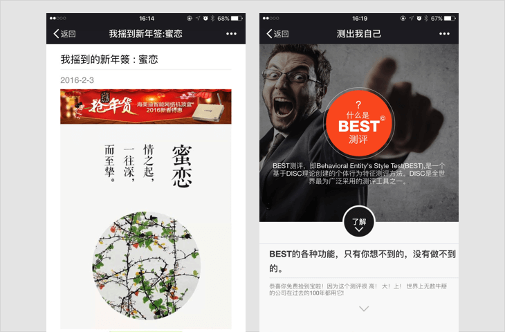
若内容中包含以上情况,一经发现,立即停止链接内容在朋友圈继续传播、停止对相关域名或IP地址进行的访问;对于情节恶劣的情况,永久封禁帐号、域名、IP地址。
-
-
欺诈类内容
-
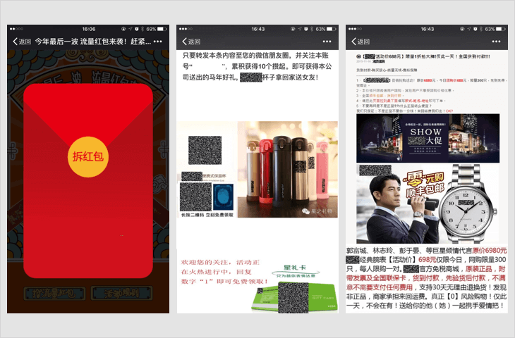
4.1 虚假红包、活动
通过虚假的红包、活动等形式,以赚取现金、实物奖品、虚拟奖品等方式欺骗用户参与的,具体形式包括但不限于虚假现金红包、虚假话费卡、虚假流量红包、虚假优惠券、虚假优惠活动等;
-
4.2 宣传或销售侵害他人合法权益的商品
通过虚假宣传、恶意营销等方式,向用户宣传或诱骗用户购买侵害他人合法权益的物品的,例如以骗取邮费为目的的赠送物品活动、虚假付费服务等;
-
4.3 仿冒微信公众帐号排版、域名
仿冒微信公众帐号文章排版、域名,可能造成微信用户混淆的;
若内容中包含以上情况,一经发现,立即永久封禁帐号、域名、IP地址。
-
-
谣言类内容
-
发送不实信息,制造谣言,可能对他人、企业或其他机构造成损害的,例如自来水有毒、香蕉致癌、小龙虾不能吃等;
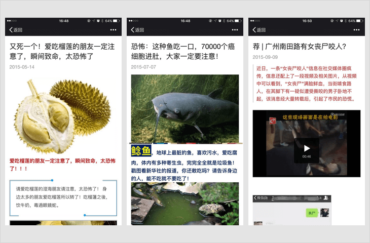
若内容中包含以上情况,一经发现,立即停止链接内容在朋友圈继续传播、停止对相关域名或IP地址进行的访问、短期封禁相关开放平台帐号或应用的分享接口;对于情节恶劣的情况,永久封禁帐号、域名、IP地址;
-
-
骚扰信息、广告信息及垃圾信息
-
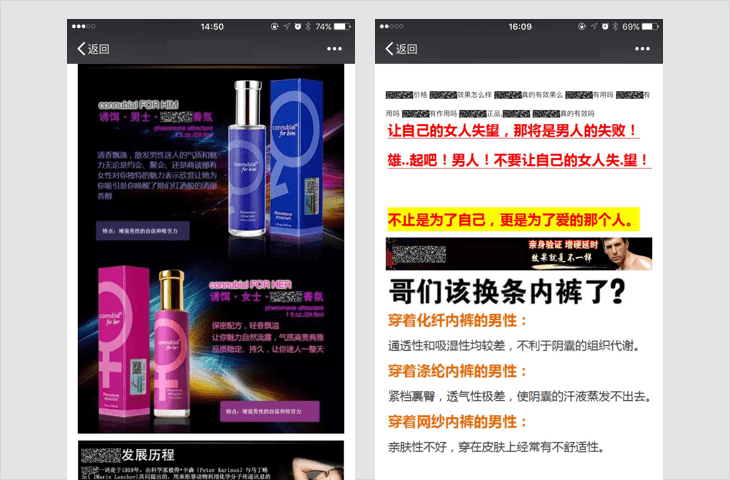
传播骚扰、欺诈、垃圾广告等信息的,包括但不限于虚假中奖类信息,不符合国家相关法律法规的保健品、药品、食品类信息,假冒伪劣商品信息,虚假服务信息,虚假网络货币等;
-
若内容中包含以上情况,一经发现,立即停止链接内容在朋友圈继续传播、停止对相关域名或IP地址进行的访问;对于情节恶劣的情况,永久封禁帐号、域名、IP地址。
-
-
题文不符、内容低俗的信息
-
7.1 题文不符的信息
故意拟制耸动标题,或以明显倾向性、误导性、煽动性的标题吸引他人点击的,即俗称“标题党”;
-
7.2 内容低俗的信息
涉及性器官、性行为、性暗示的,传播低级趣味、庸俗、有伤风化内容的,或者宣扬暴力、恶意谩骂、侮辱他人内容的,例如:传播走光、偷拍、露点、一夜情、换妻、性虐待、情色动漫、非法性药品广告和性病治疗广告、推介淫秽色情网站等;
若内容中包含以上情况,一经发现,立即停止链接内容在朋友圈继续传播、停止对相关域名或IP地址进行的访问;对于情节恶劣的情况,永久封禁帐号、域名、IP地址。
-
-
非法获取用户数据、信息
-
未经用户明确同意,并向用户如实披露数据用途、使用范围等相关信息的情形下复制、存储、使用或传输用户数据的,包括但不限于要求用户共享个人信息(手机号、出生日期等)才可使用其功能,或收集用户密码或者用户个人信息(包括但不限于,手机号,身份证号,生日,住址等);
-
若内容中包含以上情况,一经发现,立即停止链接内容在朋友圈继续传播、停止对相关域名或IP地址进行的访问,短期封禁相关帐号;对于情节恶劣的情况,永久封禁帐号、域名、IP地址。
-
-
其它违反国家法律法规的内容,包括但不限于:
-
(1) 违反宪法确定的基本原则的;
-
(2) 危害国家安全,泄露国家秘密,颠覆国家政权,破坏国家统一的;
-
(3) 损害国家荣誉和利益的;
-
(4) 煽动民族仇恨、民族歧视,破坏民族团结的;
-
(5) 破坏国家宗教政策,宣扬邪教和封建迷信的;
-
(6) 散布谣言,扰乱社会秩序,破坏社会稳定的;
-
(7) 散布淫秽、色情、赌博、暴力、恐怖或者教唆犯罪的;
-
(8) 侮辱或者诽谤他人,侵害他人合法权益的;
-
(9) 煽动非法集会、结社、游行、示威、聚众扰乱社会秩序;
-
(10) 以非法民间组织名义活动的;
-
(11) 含有法律、行政法规禁止的其他内容的。
-
若内容中包含以上情况,一经发现,立即停止链接内容在朋友圈继续传播、停止对相关域名或IP地址进行的访问,短期封禁相关帐号;对于情节恶劣的情况,永久封禁帐号、域名、IP地址。
-
申诉及常见问题可查看:http://kf.qq.com/faq/131117ne2MV7141117JzI32q.html
微信团队请用户主动遵守上述条款,也欢迎用户对违反微信链接类内容管理规范的内容进行投诉,一经核实,微信团队将立即按照规范进行处理。让我们共同创建并维护和谐的微信生态!
微信团队
在 ASP.NET 网站开发过程中,若提交的表单中包含有 HTML 代码,为了安全,.NET 会自动阻止提交,并抛出异常:
从客户端(......)中检测到有潜在危险的 Request.Form 值。
以前的做法是
WebFrom:在 <%@ Page %> 中加入 ValidateRequest="false"
MVC:给 Action 加上属性 [ValidateInput(false)]
显然这会给网站带来极大的风险,不推荐!
以下做法可以完美解决这个问题。
客户端把内容进行 HTML 编码,如:
content = $("<div />").text(content).html();服务端把内容进行 HTML 解码,如:
string title = HttpUtility.HtmlDecode(Request.Form["content"]);
| 软件名称 | 价格 | 软件介绍 |
|---|---|---|
| ProPresenter | 试用 / $399 | 一款跨平台(Mac、Windows),专为高品质现场(包括晚会、体育赛事、会议等)打造字幕及多媒体展示的软件。 (试用版是全功能的,但输出窗口有水印,试用期两周) |
| Sports Sounds Pro | 免费 / $149.95 | 一款专业用于现场事件的音控软件。 (免费版是全功能的,仅有一些限制,比如:只能播放 10 组中每组的前 3 页的第 1 行,而且只能放置 180 个按钮) |
| Miro Video Converter | 免费 | 可以导出兼容 HTML5 网页播放的视频格式(.mp4)。 |
| Vistumbler | 免费 | 无线网络扫描工具。 |
| VNC | 免费 / $30 / $40 | Mac 上优秀的远程桌面软件。 |
| 免费 | 快速扫描目录大小和空间占用 | |
| IconWorkshop | 试用 / 购买 | 优秀的 ICO、ICON 制作软件,专业图标制作,编辑,转换工具 |
| $19 / $59 | 功能强大的数字音乐编辑器,是一个集声音编辑、播放、录制和转换的音频工具。 | |
| EasyRecovery | EasyRecovery 是由全球著名数据厂商 Kroll Ontrack 出品的一款数据文件恢复软件。支持恢复不同存储介质数据:硬盘、光盘、U盘、移动硬盘、数码相机、手机、Raid 文件恢复等,能恢复包括文档、表格、图片、音视频等各种文件。 | |
| DiskGenius | 一款专业级的数据恢复软件,算法精湛、功能强大!支持多种情况下的文件丢失、分区丢失恢复;支持文件预览;支持扇区编辑、RAID 恢复等高级数据恢复功能。 | |
| sagethumbs | 免费 | 预览 PSD 文件 |
| WebP Codec for Windows | 免费 | 预览 WebP 文件 |
| ventoy | 免费 | 多系统启动U盘解决方案 |
| 普通订阅号 | 认证订阅号 | 普通服务号 | 认证服务号 | |
|---|---|---|---|---|
| 注册主体为个人类型 | √ | × | × | × |
| 注册主体为企业类型(个体工商户,无对公账户) | × | √ | × | √(不能申请微信支付?) |
| 注册主体为企业类型(个体工商户,有对公账户) | √ | √ | √ | √ |
| 注册主体为企业类型(企业公司类) | √ | √ | √ | √ |
| 群发 | 每天 1 条 | 每天 1 条 | 每月 4 条 | 每月 4 条 |
| 接口权限 | 参:https://mp.weixin.qq.com/wiki?t=resource/res_main&id=mp1433401084 | |||
参考资料
http://kf.qq.com/faq/120911VrYVrA130619v6zaAn.html
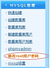
关于wdcp后台要用mysql root用户密码的说明,可以看这里
http://www.wdlinux.cn/bbs/thread-932-1-1.html
要在wdcp后台里创建数据库及数据库用户,那就必须要让wdcp里有root用户密码,否则,就无法创建
所以,有些用户说,在phpmyadmin修改了root用户密码后,就无法创建了,那是肯定的,因为你改了root的密码,但wdcp不知道,也不知道新密码是什么,那还能创建吗?答案是 肯定是不能的
那要怎样正确地修改root用户的密码呢?难道就不难修改了吗,当然不是
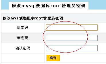
只要在wdcp的后台里修改就可以了,所以也强烈建议在wdcp后台里修改,如下图
那如果已经修改了或在其它地方修改了还有办法吗
有,可以上面那个连接的说明
又或者用这个工具修改,wdcp2.2版本开始提供
用ssh登录到服务器上运行
sh /www/wdlinux/tools/mysql_root_chg.sh
就可以了
这个工具修改,还可以用在忘记root用户密码的时候修改,是强制修改
注:这里说的root用户,是mysql数据库里的root用户,不是Linux系统的root用户,有区别的
默认安装,PHP里只是安装了一些常用或基本的模块,其它的要用时再添加就可以的
这里模块分两种
一种是php自带的模块,也就是源码里就有,不用下载
一种是要另外下载的安装模块,如
http://www.wdlinux.cn/bbs/thread-4-1-1.html
这里只介绍,在PHP自带的模块
比如SOAP
首先,确定之前有下载的一键包,如果没有,先下载(也可以单独下载PHP软件包)
wget http://dl.wdlinux.cn:5180/lanmp_last.tar.gz
tar zxvf lanmp_last.tar.gz
cd lanmp
tar zxvf php-5.2.17.tar.gz
cd php-5.2.17
cd ext/soap
/www/wdlinux/php/bin/phpize
./configure --with-php-config=/www/wdlinux/php/bin/php-config
make
make install
echo 'extension=soap.so' >> /www/wdlinux/etc/php.ini
然后重起下服务
service httpd restart
or
service nginxd restart
其它所有的模块,参考这两个例子即可完成安装

编者按:今天腾讯万技师同学的这篇技术总结必须强烈安利下,目录清晰,层次分明,每个接口都有对应的简介、系统要求、实例、核心代码以及超实用的思维发散,帮你直观把这些知识点get起来。以现在HTML 5的势头,同志们,你看到的这些,可都是钱呐。
十二年前,无论多么复杂的布局,在我们神奇的table面前,都不是问题;
十年前,阿捷的一本《网站重构》,为我们开启了新的篇章;
八年前,我们研究yahoo.com,惊叹它在IE5下都表现得如此完美;
六年前,Web标准化成了我们的基础技能,我们开始研究网站性能优化;
四年前,我们开始研究自动化工具,自动化测试,谁没玩过nodejs都不好意思说是页面仔;
二年前,各种终端风起云涌,响应式、APP开发都成为了我们研究的范围,CSS3动画开始风靡;
如今,CSS3动画、Canvas、SVG、甚至webGL你已经非常熟悉,你是否开始探寻,接下来,我们可以玩什么,来为我们项目带来一丝新意?
没错,本文就是以HTML5 Device API为核心,对HTML5的一些新接口作了一个完整的测试,希望能让大家有所启发。
目录:
一、让音乐随心而动 – 音频处理 Web audio API
二、捕捉用户摄像头 – 媒体流 Media Capture
三、你是逗逼? – 语音识别 Web Speech API
四、让我尽情呵护你 – 设备电量 Battery API
五、获取用户位置 – 地理位置 Geolocation API
六、把用户捧在手心 – 环境光 Ambient Light API
七、陀螺仪 Deviceorientation
八、Websocket
九、NFC
十、震动 - Vibration API
十一、网络环境 Connection API
一、让音乐随心而动 – 音频处理 Web audio API
简介:
Audio对象提供的只是音频文件的播放,而Web Audio则是给了开发者对音频数据进行分析、处理的能力,比如混音、过滤。
系统要求:
ios6+、android chrome、android firefox
实例:

http://sy.qq.com/brucewan/device-api/web-audio.html
核心代码:
var context = new webkitAudioContext();
var source = context.createBufferSource();   // 创建一个声音源
source.buffer = buffer;   // 告诉该源播放何物
createBufferSourcesource.connect(context.destination);   // 将该源与硬件相连
source.start(0); //播放
技术分析:
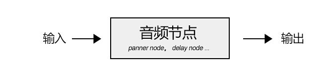
当我们加载完音频数据后,我们将创建一个全局的AudioContext对象来对音频进行处理,AudioContext可以创建各种不同功能类型的音频节点AudioNode,比如
1、源节点(source node)
我们可以使用两种方式加载音频数据:
<1>、audio标签
var sound, audio = new Audio();
audio.addEventListener('canplay', function() {
 sound = context.createMediaElementSource(audio);
 sound.connect(context.destination);
});
audio.src = '/audio.mp3';
<2>、XMLHttpRequest
var sound, context = createAudioContext();
var audioURl = '/audio.mp3'; // 音频文件URL
var xhr = new XMLHttpRequest();
xhr.open('GET', audioURL, true);
xhr.responseType = 'arraybuffer';
xhr.onload = function() {
 context.decodeAudioData(request.response, function (buffer) {
 source = context.createBufferSource();
 source.buffer = buffer;
 source.connect(context.destination);
 }
}
xhr.send();
2、分析节点(analyser node)
我们可以使用AnalyserNode来对音谱进行分析,例如:
var audioCtx = new (window.AudioContext || window.webkitAudioContext)();
var analyser = audioCtx.createAnalyser();
analyser.fftSize = 2048;
var bufferLength = analyser.frequencyBinCount;
var dataArray = new Uint8Array(bufferLength);
analyser.getByteTimeDomainData(dataArray);

function draw() {
 drawVisual = requestAnimationFrame(draw);
 analyser.getByteTimeDomainData(dataArray);
 // 将dataArray数据以canvas方式渲染出来
};

draw();
3、处理节点(gain node、panner node、wave shaper node、delay node、convolver node等)
不同的处理节点有不同的作用,比如使用BiquadFilterNode调整音色(大量滤波器)、使用ChannelSplitterNode分割左右声道、使用GainNode调整增益值实现音乐淡入淡出等等。
需要了解更多的音频节点可能参考:
https://developer.mozilla.org/en-US/docs/Web/API/Web_Audio_API
4、目的节点(destination node)
所有被渲染音频流到达的最终地点
思维发散:
1、可以让CSS3动画跟随背景音乐舞动,可以为我们的网页增色不少;
2、可以尝试制作H5酷酷的变声应用,增加与用户的互动;
3、甚至可以尝试H5音乐创作。
看看google的创意:http://v.youku.com/v_show/id_XNTk0MjQyNDMy.html
二、捕捉用户摄像头 – 媒体流 Media Capture
简介:
通过getUserMedia捕捉用户摄像头获取视频流和通过麦克风获取用户声音。
系统要求:
android chrome、android firefox
实例:
捕获用户摄像头 捕获用户麦克风

http://sy.qq.com/brucewan/device-api/camera.html

http://sy.qq.com/brucewan/device-api/microphone-usermedia.html
核心代码:
1、摄像头捕捉
navigator.webkitGetUserMedia ({video: true}, function(stream) {
 video.src = window.URL.createObjectURL(stream);
 localMediaStream = stream;
}, function(e){

})
2、从视频流中拍照
btnCapture.addEventListener('touchend', function(){
	if (localMediaStream) {
		canvas.setAttribute('width', video.videoWidth);
		canvas.setAttribute('height', video.videoHeight);
		ctx.drawImage(video, 0, 0);
	}
}, false);
3、用户声音录制
navigator.getUserMedia({audio:true}, function(e) {
	context = new audioContext();
	audioInput = context.createMediaStreamSource(e);
	volume = context.createGain();
	recorder = context.createScriptProcessor(2048, 2, 2);
	recorder.onaudioprocess = function(e){
		recordingLength += 2048;
		recorder.connect (context.destination);
	}
}, function(error){});
4、保存用户录制的声音
var buffer = new ArrayBuffer(44 + interleaved.length * 2);
var view = new DataView(buffer);
fileReader.readAsDataURL(blob); // android chrome audio不支持blob
… audio.src = event.target.result;
思维发散:
1、从视频拍照自定义头像;
2、H5视频聊天;
3、结合canvas完成好玩的照片合成及处理;
4、结合Web Audio制作有意思变声应用。
三、你是逗逼? – 语音识别 Web Speech API简介:
1、将文本转换成语音;
2、将语音识别为文本。
系统要求:
ios7+,android chrome,android firefox
测试实例:

http://sy.qq.com/brucewan/device-api/microphone-webspeech.html
核心代码:
1、文本转换成语音,使用SpeechSynthesisUtterance对象;
var msg = new SpeechSynthesisUtterance();
var voices = window.speechSynthesis.getVoices();
msg.volume = 1; // 0 to 1
msg.text = ‘识别的文本内容’;
msg.lang = 'en-US';
speechSynthesis.speak(msg);
2、语音转换为文本,使用SpeechRecognition对象。
var newRecognition = new webkitSpeechRecognition();
newRecognition.onresult = function(event){
	var interim_transcript = '';
	for (var i = event.resultIndex; i < event.results.length; ++i) {
		final_transcript += event.results[i][0].transcript;
	}
};
测试结论:
1、Android支持不稳定;语音识别测试失败(暂且认为是某些内置接口被墙所致)。
思维发散:
1、当语音识别成为可能,那声音控制将可以展示其强大的功能。在某些场景,比如开车、网络电视,声音控制将大大改善用户体验;
2、H5游戏中最终分数播报,股票信息实时声音提示,Web Speech都可以大放异彩。
四、让我尽情呵护你 – 设备电量 Battery API简介:
查询用户设备电量及是否正在充电。
系统要求:
android firefox
测试实例:

http://sy.qq.com/brucewan/device-api/battery.html
核心代码:
var battery = navigator.battery || navigator.webkitBattery || navigator.mozBattery || navigator.msBattery;
var str = '';
if (battery) {
 str += '<p>你的浏览器支持HTML5 Battery API</p>';
 if(battery.charging) {
 str += '<p>你的设备正在充电</p>';
} else {
 str += '<p>你的设备未处于充电状态</p>';
}
 str += '<p>你的设备剩余'+ parseInt(battery.level*100)+'%的电量</p>';
} else {
 str += '<p>你的浏览器不支持HTML5 Battery API</p>';
}
测试结论:
1、QQ浏览器与UC浏览器支持该接口,但未正确显示设备电池信息;
2、caniuse显示android chrome42支持该接口,实测不支持。
思维发散:
相对而言,我觉得这个接口有些鸡肋。
很显然,并不合适用HTML5做电池管理方面的工作,它所提供的权限也很有限。
我们只能尝试做一些优化用户体验的工作,当用户设备电量不足时,进入省电模式,比如停用滤镜、摄像头开启、webGL、减少网络请求等。
五、获取用户位置 – 地理位置 Geolocation简介:
Geolocation API用于将用户当前地理位置信息共享给信任的站点,目前主流移动设备都能够支持。
系统要求:
ios6+、android2.3+
测试实例:

http://sy.qq.com/brucewan/device-api/geolocation.html
核心代码:
var domInfo = $("#info");

// 获取位置坐标
if (navigator.geolocation) {
	navigator.geolocation.getCurrentPosition(showPosition,showError);
}
else{
	domInfo.innerHTML="抱歉,你的浏览器不支持地理定位!";
}

// 使用腾讯地图显示位置
function showPosition(position) {
	var lat=position.coords.latitude;
	var lon=position.coords.longitude;

	mapholder = $('#mapholder')
	mapholder.style.height='250px';
	mapholder.style.width = document.documentElement.clientWidth + 'px';

	var center = new soso.maps.LatLng(lat, lon);
	var map = new soso.maps.Map(mapholder,{
		center: center,
		zoomLevel: 13
	});

	var geolocation = new soso.maps.Geolocation();
	var marker = null;
	geolocation.position({}, function(results, status) {
		console.log(results);
		var city = $("#info");
		if (status == soso.maps.GeolocationStatus.OK) {
			map.setCenter(results.latLng);
			domInfo.innerHTML = '你当前所在城市: ' + results.name;
		if (marker != null) {
			marker.setMap(null);
		}
		// 设置标记
		marker = new soso.maps.Marker({
			map: map,
			position:results.latLng
		});
		} else {
			alert("检索没有结果,原因: " + status);
		}
	});
}
测试结论:
1、Geolocation API的位置信息来源包括GPS、IP地址、RFID、WIFI和蓝牙的MAC地址、以及GSM/CDMS的ID等等。规范中没有规定使用这些设备的先后顺序。
2、初测3g环境下比wifi环境理定位更准确;
3、测试三星 GT-S6358(android2.3) geolocation存在,但显示位置信息不可用POSITION_UNAVAILABLE。
六、把用户捧在手心 – 环境光 Ambient Light简介:
Ambient Light API定义了一些事件,这些时间可以提供源于周围光亮程度的信息,这通常是由设备的光感应器来测量的。设备的光感应器会提取出辉度信息。
系统要求:
android firefox
测试实例:

http://sy.qq.com/brucewan/device-api/ambient-light.html
核心代码:
这段代码实现感应用前当前环境光强度,调整网页背景和文字颜色。
var domInfo = $('#info');
if (!('ondevicelight' in window)) {
	domInfo.innerHTML = '你的设备不支持环境光Ambient Light API';
} else {
	var lightValue = document.getElementById('dl-value');
	window.addEventListener('devicelight', function(event) {
		domInfo.innerHTML = '当前环境光线强度为:' + Math.round(event.value) + 'lux';
		var backgroundColor = 'rgba(0,0,0,'+(1-event.value/100) +')';
		document.body.style.backgroundColor = backgroundColor;
		if(event.value < 50) {
			document.body.style.color = '#fff'
		} else {
			document.body.style.color = '#000'
		}
	});
}
思维发散:
该接口适合的范围很窄,却能做出很贴心的用户体验。
1、当我们根据Ambient Light强度、陀螺仪信息、当地时间判断出用户正躺在床上准备入睡前在体验我们的产品,我们自然可以调整我们背景与文字颜色让用户感觉到舒适,我们还可以来一段安静的音乐,甚至使用Web Speech API播报当前时间,并说一声“晚安”,何其温馨;
2、该接口也可以应用于H5游戏场景,比如日落时分,我们可以在游戏中使用安静祥和的游戏场景;
3、当用户在工作时间将手机放在暗处,偷偷地瞄一眼股市行情的时候,我们可以用语音大声播报,“亲爱的,不用担心,你的股票中国中车马上就要跌停了”,多美的画面。
参考文献:
https://developer.mozilla.org/en-US/docs/Web/API
http://webaudiodemos.appspot.com/
http://www.w3.org/2009/dap/
1. 跨子域的iframe高度自适应
2. 完全跨域的iframe高度自适应
同域的我们可以轻松的做到
1. 父页面通过iframe的contentDocument或document属性访问到文档对象,进而可以取得页面的高度,通过此高度值赋值给iframe tag。
2. 子页面可以通过parent访问到父页面里引入的iframe tag,进而设置其高度。
但跨域的情况则不允许对子页面或父页面的文档进行访问(返回undefined),所以我们要做的就是打通或间接打通这个壁垒。
一、跨子域的iframe高度自适应
比如 'a.jd.com/3.html' 嵌入了 'b.jd.com/4.html',这种跨子域的页面
3.html
|
1 2 3 4 5 6 7 8 9 10 11 12 13 |
|
4.html
|
1 2 3 4 5 6 7 8 9 10 11 12 13 14 15 16 17 18 19 20 21 22 23 24 25 26 27 28 |
|
可以看到与上一篇对比,只要在两个页面里都加上document.domain就可以了
二、完全跨域的iframe高度自适应
分别有以下资源
- 页面 A:http://snandy.github.io/lib/iframe/A.html
- 页面 B:http://snandy.github.io/lib/iframe/B.html
- 页面 C:http://snandy.jd-app.com
- D.js:http://snandy.github.io/lib/iframe/D.js
这四个资源有如下关系
1. A里嵌入C,A和C是不同域的,即跨域iframe
2. C里嵌入B,C和B是不同域的,但A和B是同域的
3. C里嵌入D.js,D.js放在和A同域的项目里
通过一个间接方式实现,即通过一个隐藏的B.html来实现高度自适应。
A.html
嵌入页面C: http://snandy.jd-app.com
|
1 2 3 4 5 6 7 8 9 10 |
|
B.html
嵌入在C页面中,它是隐藏的,通过parent.parent访问到A,再改变A的iframe(C.html)高度,这是最关键的,因为A,B是同域的所以可以访问A的文档对象等。
|
1 2 3 4 5 6 7 8 9 10 11 12 13 14 15 16 17 18 19 20 21 22 23 24 25 26 27 28 |
|
C.html
嵌入在A中,和A不同域,要实现C的自适应,C多高则A里的iframe就设为多高。C里嵌入B.html 和 D.js
|
1 2 3 4 5 6 7 8 9 10 11 12 13 14 15 16 17 18 19 |
|
D.js
在页面C载入后计算其高度,然后将计算出的height赋值给C里引入的iframe(B.html)的src
|
1 2 3 4 5 6 7 8 9 10 11 12 13 14 15 16 |
|
线上示例:http://snandy.github.io/lib/iframe/A.html
Apple’s newest devices feature the Retina Display, a screen that packs double as many pixels into the same space as older devices. For designers this immediately brings up the question, “What can I do to make my content look outstanding on these new iPads and iPhones?”. First there are a few tough questions to consider, but then this guide will help you get started making your websites and web apps look amazingly sharp with Retina images!

Things to Consider When Adding Retina Images
The main issue with adding retina images is that the images are double as large and will take up extra bandwidth (this won’t be an issue for actual iOS apps, but this guide is covering web sites & web apps only). If your site is mostly used on-the-go over a 3G network it may not be wise to make all your graphics high-definition, but maybe choose only a select few important images. If you’re creating something that will be used more often on a WI-FI connection or have an application that is deserving of the extra wait for hi-res graphics these steps below will help you target only hi-res capable devices.
Simple Retina Images
The basic concept of a Retina image is that your taking a larger image, with double the amount of pixels that your image will be displayed at (e.g 200 x 200 pixels), and setting the image to fill half of that space (100 x 100 pixels). This can be done manually by setting the height and width in HTML to half the size of your image file.
<img src="my200x200image.jpg" width="100" height="100">
If you’d like to do something more advanced keep reading below for how you can apply this technique using scripting.
Creating Retina Icons for Your Website
When users add your website or web app to their homescreen it will be represented by an icon. These sizes for regular and Retina icons (from Apple) are as follows:
| iPhone | 57 x 57 |
|---|---|
| Retina iPhone | 114 x 114 |
| iPad | 72 x 72 |
| Retina iPad | 144 x 144 |
For each of these images you create you can link them in the head of your document like this (if you want the device to add the round corners remove -precomposed):
<link href="touch-icon-iphone.png" rel="apple-touch-icon-precomposed" />
<link href="touch-icon-ipad.png" rel="apple-touch-icon-precomposed" sizes="72x72" />
<link href="touch-icon-iphone4.png" rel="apple-touch-icon-precomposed" sizes="114x114" />
<link href="touch-icon-ipad3.png" rel="apple-touch-icon-precomposed" sizes="144x144" />
If the correct size isn’t specified the device will use the smallest icon that is larger than the recommended size (i.e. if you left out the 114px the iPhone 4 would use the 144px icon).
Retina Background Images
Background images that are specified in your CSS can be swapped out using media queries. You’ll first want to generate two versions of each image. For example ‘bgPattern.png’ at 100px x 100px and ‘bgPattern@2x.png’ at 200px x 200px. It will be useful to have a standard naming convention such as adding @2x for these retina images. To add the new @2x image to your site simply add in the media query below (You can add any additional styles that have background images within the braces of the same media query):
.repeatingPattern {
     background: url(../images/bgPattern.png) repeat;
     background-size: 100px 100px;
}

@media only screen and (-webkit-min-device-pixel-ratio: 2) {
     .repeatingPattern {
          background: url(../images/bgPattern@2x.png) repeat;
     }
}
JavaScript for Retina Image Replacement
For your retina images that aren’t backgrounds the best option seems to be either creating graphics with CSS, using SVG, or replacing your images with JavaScript. Just like the background images, you’ll want to create a normal image and one ‘@2x’ image. Then with JavaScript you can detect if the pixel ratio of the browser is 2x, just like you did with the media query:
if (window.devicePixelRatio == 2) {

//Replace your img src with the new retina image

}
If you’re using jQuery you could quickly replace all your images like this very basic example below. It’s a good idea to add a class to identify the images with hi-res versions so you don’t replace any others by mistake. I’ve added a class=”hires” for this example. Also make sure you have the standard (non-retina) image height and width set in the HTML:
<img class="hires" alt="" src="search.png" width="100" height="100" />
<script type="text/javascript">
$(function () {

	if (window.devicePixelRatio == 2) {

          var images = $("img.hires");

          // loop through the images and make them hi-res
          for(var i = 0; i < images.length; i++) {

            // create new image name
            var imageType = images[i].src.substr(-4);
            var imageName = images[i].src.substr(0, images[i].src.length - 4);
            imageName += "@2x" + imageType;

            //rename image
            images[i].src = imageName;
          }
     }

});
</script>
Server-Side Retina Images
If you’d like to implement a server-side retina image solution, I recommend checking out Jeremy Worboys’ Retina Images (which he also posted in the comments below). His solution uses PHP code to determine which image should be served. The benefit of this solution is that it doesn’t have to replace the small image with the retina one so you’re using less bandwidth, especially if you have lots of images that you’re replacing.
Website Optimization for Retina Displays
If you’re looking for additional information on creating Retina images, I’ve recently had a short book published called Website Optimization for Retina Displays that covers a range of related topics. It contains some of what is above, but also includes samples for many different situations for adding Retina images. It explains the basics of creating Retina images, backgrounds, sprites, and borders. Then it talks about using media queries, creating graphics with CSS, embedding fonts, creating app icons, and more tips for creating Retina websites.